I have recently designed my own deck of playing cards, the Micaya Deck.
I’m not a designer but I always loved playing cards. My interest in them is mostly from the playing aspect, I love the idea of a game system and the versatility of them. And I love unusual designs.
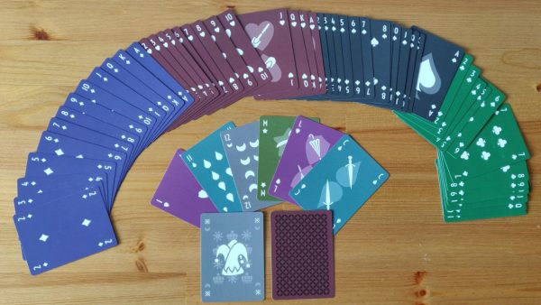
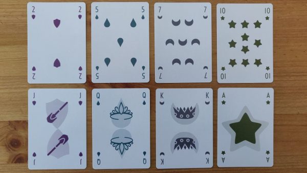
The Micaya Deck has 4 more suits and 7 more ranks than a standard deck and has a clear and minimalist design.
I initially only designed it for myself as a fun hobby project, but have opened the designs up on MakePlayingCards’s marketplace where anyone interested can purchase them.
In this blog post I’ll explain some of my design choices and the history of the Micaya Deck.
General design
I like dark backgrounds and clear, minimalist, simplistic, flat, abstract designs. After making my own Love Letter version recently, which all have white flat graphics and text on a dark and differently coloured background, making playing cards in a similar style was the natural next step.
When I had the physical cards of my first test print in my hands, I noticed that because every suit has its own background colour, you can sort of tell the suit from looking at the cards from the side in some circumstances. It’s not that bad, really, but I would not advice to play any serious games with them.
I tried to fix that by adding the same border to the front of the cards. I tried a solid border and a gradient border. I tried a dark border and a light border. But whatever I did, it never looked right.
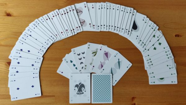
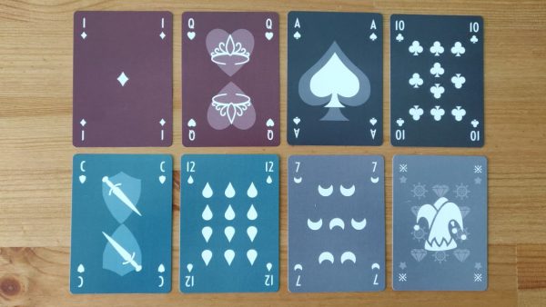
Instead of fixing this in the dark version I decided to keep it but I also designed a version with a light background. That version has a more classic look, it has dark and differently coloured graphics and text on an off white background. Cards from that will definitely not reveal their suit.
The indices are in all four corners to make it possible to fan them in either direction.
It was quite difficult to find a good font for indices. I tried hundreds of fonts and multiple test prints to find one which is narrow enough and has its own character while still being very readable. When I found “Voltaire”, it ticked all the boxes and I’m really happy with it.

Suits
I originally only wanted one more suit (to be able to play Lost Cities), but then got into searching for good alternative suits and found four more suits which made sense and worked well.
I’ve looked a lot at other alternative suits, either from historic or modern decks. But I was really disappointed with most of them. They rarely fit the genius simple design of the French suits (diamonds, hearts, spades, clubs). One of the reasons why the French deck became so popular is because the suits are so simple that it’s easy to create stamps which made them easier and cheaper to produce.
Simplicity made them successful, so, whichever additional suits I would pick, they’d have to be as simplistic. And something else I noticed: They all have at least one curve and one spike and are vertically symmetric. (Diamonds don’t always have curves, but some variants have, like the one I used here.) I tried to find suits which would meet those criteria.
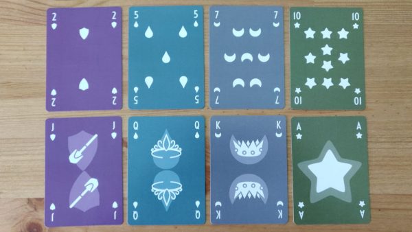
So, I chose: shields, drops, moons, stars.
The stars don’t have curves either, but they could have. The reason why I had to have stars is because that is the one constant alternative suit that appears everywhere. And it pairs well with moons. It makes sense and was the first one I’ve chosen.
I always liked the thought of four-colour decks where all suits have different colours. Naturally, I wanted my deck to have four coloured suits as well. They make it easier to distinguish the different suits which is better for some games. Although in other card games they will make pairing more difficult because there are no two red suits and two black suits anymore.
That’s why I also created an alternative more traditional two-colour deck.
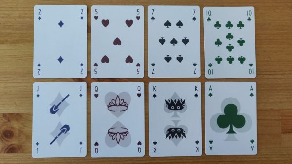
I used the most common four colour combination: blue diamonds, red hearts, black spades, green clubs. I like the second-most common option of using yellow diamonds, but that wouldn’t look good in a dark deck.
The other colours fit the theme of the other suits: Shields is purple is royal, drops is teal is watery, moons is grey is nighty and stars is yellow(ish) is shiny.
Ranks
I didn’t mirror the pips at first. I didn’t see the point because it only works well with even numbers. But when I had the physical cards in my hand, I was surprised that I found it more annoying than I anticipated, so the final version does mirror the pips.
I’ve intentionally made the distribution of the pips different to classic cards. That was mainly because it was easier to do this way.
The face cards are quite minimalist. I didn’t want to have any unnecessary elements. I chose to add the transparent suit to the background rather than a single solid suit to the side to make it more symmetric and less in the way of the minimalist design.
I love designs which somehow merge the face and the suit. But I don’t have enough design skills to pull something like that off.
I initially only wanted one more rank as that already existed (historically and in a Tarot deck). But when I had to print amounts of cards that were divisible by 18 (or I would have to pay for blank cards), I also added 1 (which is used in some other decks and makes it possible to use 1 and Ace differently), 11, 12 (which fills the suit grid nicely and makes some historic sense, thinking of the duodecimal system) and a Maid, a Cavalier and a Lady.
Originally there were three clear ranks (Knave, Knight, King) but I also wanted something female to have an equal balance of gendered cards. Adding a female equivalent to the Jack was my starting point. But I also liked those three ranks. So, I started to look for a middle rank pair as well to go with the low rank pair (the Jack plus its female equivalent) and the high rank pair (King and Queen).
It was really tricky to find a pair of nouns that are a) clearly of middle rank, b) clearly male and female and c) don’t start with J, Q, K or A.
A Tarot deck has the Knight as a fourth face card, often called a Cavalier. That was a good candidate to keep for the middle male card.
Other decks have a Princess but I didn’t find that fitting as there is no equivalent Prince. A Maid as a female servant made sense to pair with the Jack. And a Lady or Dame as the female equivalent of a Knight made sense to pair with the Cavalier. A Dame is also already used in lots of other languages instead of the Queen.
After I decided to use this structure, I found that there is one historic deck which put all those face cards together in 1466 the same way I did. Wikipedia says:
[T]he Cary-Yale deck […] added queens, mounted ladies, and maids as counterparts to the males.
As for the images for the face cards, the higher pair has typical headgear (a tiara and a crown), the medium pair has typical weapons (a sword and a sword hidden in an umbrella) and the lower pair has typical tools (scissors and a spade).
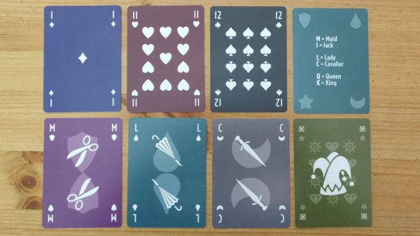
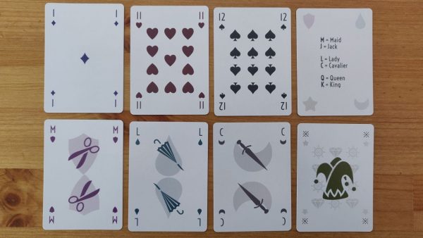
Jokers
As with standard decks, the jokers are a bit more elaborate.
They pay tribute to lots of other alternative suits and show a transparent version of them in the background.
The four jokers in the standard suits show their equivalent Latin and Germanic suits.
The four jokers in the alternative suits are grouped by theme and show symbols which are used in other alternative suits: Shields show horseshoes and horns, drops show anchors and shells, moons show suns and crowns, stars show steering wheels and jewels.
(The crown is the only symbol which doesn’t really fit into the theme of moons, but I couldn’t fit it anywhere else.)
I’ve also added a transparent suit to the jokers’ indices, so they can potentially be treated as an additional face card. It also adds a way to distinguish them for colourblind people when fanning.
There is a reference symbol (※) where the rank would be. Most decks use a star, but because I already use the star for an alternative suit, I had to use something else.

Name
As with most things, finding a name was the hardest and it was the very last thing I decided. I will spare you the hundreds of bad names I came up with and will just explain where “Micaya” comes from. The “mi” is coming from its main design aspect, its minimalism. The “caya” is coming from the “Cary-Yale” deck mentioned above that also had an additional Maid, Knight and Lady.
But knowing what the name means is unimportant. What’s more important is that it sounds like it could fit into many cultures, is easy to pronounce (I hope) and doesn’t already have a company or product with the same name.
Games
New suits and ranks are great. But what games can you actually play with this deck?
I know most people would only be interested in such a deck if they knew which exciting games they could play with it that would benefit from an extended deck.
I’ve got a vague idea of some games that fit that criterion. But in order to fully figure this out, I’ve bought a couple of books on hundreds of card games and plan to learn most of them.
I might follow this post up with a list of games and/or a collection of rules.
Credits
All icons come from the brilliant game-icons.net.
The font used for the indices is Voltaire.
The design is my own, obviously inspired by hundreds of other decks.
This first print is by MakePlayingCards.com.
The graphic software I used to create the deck is… none!
I am a web developer and had started designing the deck in pure HTML and CSS. I had planned to move over a more sophisticated graphic design software, like Inkscape or The Gimp. But when I tried that it just slowed me down a lot. So, I stuck with HTML and CSS and made huge screenshots of each card.
And to my surprise the quality of the print looks as good as if I had used a graphics tool. You really cannot tell that it was not made with a more appropriate tool.
Where to buy
MakePlayingCards.com’s Marketplace and some other similar shops have the great advantage that as a designer you don’t need to pay anything upfront. You just offer the design, and when someone buys a copy, they literally produce that single deck just for them.
That makes it super easy and literally risk-free to publish it. But it also makes it quite expensive for buyers.
I’ve chosen MakePlayingCards.com mostly because they are really flexible, give you lots of options, let you do everything online and automate most of the process.
But I might choose to sell it on other similar shops later.
You can get a combination of the dark or the light version and with individual or usual colours per suit, as a whole deck or a subset from my MPC shop space.
I’ve also created a tiny microsite to have a short and single URL to share:
micaya.selfthinker.org.
Update 18 June 2019
The deck is now also available on The Game Crafter. That is a print-on-demand service located in the USA. (MPC is in Hong Kong.)
There ought to be a niche market for a deck with ranks 0~F. The zero can be like an ace but with a circle-slash over the pip.