I wrote this blog post in December 2013 (and updated it in February 2014) for the company I work for, Zopa. But for some reason it never got published on Zopa’s blog. As I still think it’s valuable, despite being out-dated, I decided to publish it here on my own blog.
The Challenge
Take 5 different platforms and code bases (www|secure2|secure|blog|help.zopa.com) and make them responsive, i.e. ready for mobile devices. While doing that, redesign everything to look and behave better, make the code more accessible and don’t hold up any other work on those platforms. And do all of that on the side while working mainly on other projects.
Unify the frontend
The first thing that was clear to me was that those 5 platforms needed to share at least the same frontend code. It needed to be the same markup, it needed to have the same CSS and JavaScript and it needed to look and behave the same.
Other improvements along the way
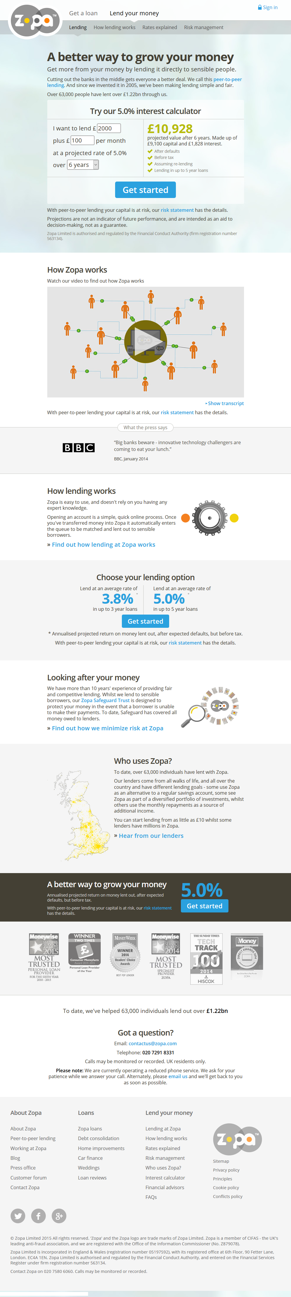
Part of the changes would also include a redesign. The website design as it was at the beginning of 2013 was largely the same as it was back in 2006. 7 years are half an eternity in web years and some modernisation was needed. Naturally, a complete rewrite of the frontend code was required. But it was also clear that the site-wide coding quality and maintainability could be improved, along with making the site more accessible for users with disabilities.
Don’t disturb our users
Another thing our team made clear was that it needed to be done in an agile way, i.e. in small releasable chunks. That way of working also suited our designer who wanted the changes to consist of many small ones instead of fewer more radical ones, so that our users get used to the new design gradually without noticing too much of a difference. Not doing a so-called “big bang release” also minimises other risks.
The Plan
- Prepare the two main platforms (www.zopa.com and secure2.zopa.com) for what’s to come. This includes adding flags to pages and loading mobile styles in restricted cases. At this stage, there are no changes that our customers would notice.
- Create the new and responsive structure and design for the “shell” (i.e. header, footer and grid).
- Integrate the new shell and basic styling into the two main platforms. That will need to work on both old design pages and new design pages. Test a lot, as those changes will be visible to everyone.
- Take one page or workflow on either of the two platforms and a) move it over to the new style by setting a flag, fix probable issues, delete old code and b) make responsive whichever elements are not responsive yet, working closely with the designer while doing that. The responsiveness of the pages which have gone through this process would not be live yet (although they could be), but can be tested in our testing platform or when adding a certain parameter to a URL on the live website.
- Repeat step 4 as often as necessary…
When all of that is done to the most important pages, it will only be a matter of deciding when to switch on the responsiveness on the live server completely. When that happens, integrate the design into the remaining platforms as well.
The Execution
Timeline of what actually happened
- 14 February 2013: The above plan was devised
- 20-25 February: Preparations released, including mobile switch (i.e. step 1 in the plan)
- 21 February: Finished prototype (step 2) and first version of style guide
- 28 February: Integrated new shell into secure2.zopa.com (step 3), but “uglified” header to look like the old one as not all platforms could be updated at the same time
- 19 April: Integrated new shell into www.zopa.com (still step 3)
- 30 April: First pages in new design are released (new lending section and the Safeguard offer flow)
- 16 May: New and much nicer header gets released to all platforms (except the blog), together with a new heading font (“Rooney Sans Web”)
- 4-24 May: Prepared all sidebar components to be used in the new design
- 11 June: The borrowing section got released in the new design
- 22 July: The home page got ported to the new design, although barely noticeable as it’s as close to the old design as possible, but is still important to enable its responsiveness
- 12 August: Re-designed all elements in the sidebar
- 28 August: Switched mobile design on for all users
- 1 October: Blog gets integrated into www.zopa.com and as such is fully re-designed and responsive
- 10-11 September: Ported lender registration and lender dashboard to new responsive design
- 27 November: Ported borrower registration to new responsive design
- 22-28 January 2014: Ported final pages on secure2.zopa.com
- 25 February: Homepage got properly redesigned
Style Guide
A style guide is a good way to communicate which design and rules to follow when making or changing a website. It ensures consistency and reduces duplication. Such style guides are often static documents, produced before a re-design, and therefore soon outdated. Zopa’s style guide is a living document instead, which adapts to changes as they’re done to fit our agile style of working. It helps frontend developers get an overview and gives backend developers a tool to do frontend work more easily.
The Future
The new responsive design is nearly completely implemented by now. The only section missing is “My Loan Book”.
Apart from that there are still a lot of small things left to improve: Some sections got implemented in a hurry and would need a proper re-think (e.g. the borrower dashboard). We can test in more devices, fine-tune some elements, improve accessibility in certain areas and amend some technical bits in the background for better maintainability.
Since I originally wrote that blog post in 2013 two more related things happened which are worth mentioning:
We moved all the shared assets (CSS, JavaScript, images and also the style guide) into their own repository and share them via git subtree now. This is quite important for the maintenance of the frontend code as it helps syncing it between all the different platforms (originally 5, now even more).
And the website went through another redesign in June and July 2014. Having made the above changes first and having had the style guide made that redesign so much easier. Although the new design looks very different to the old design, it was, again, done in an agile and iterative way.
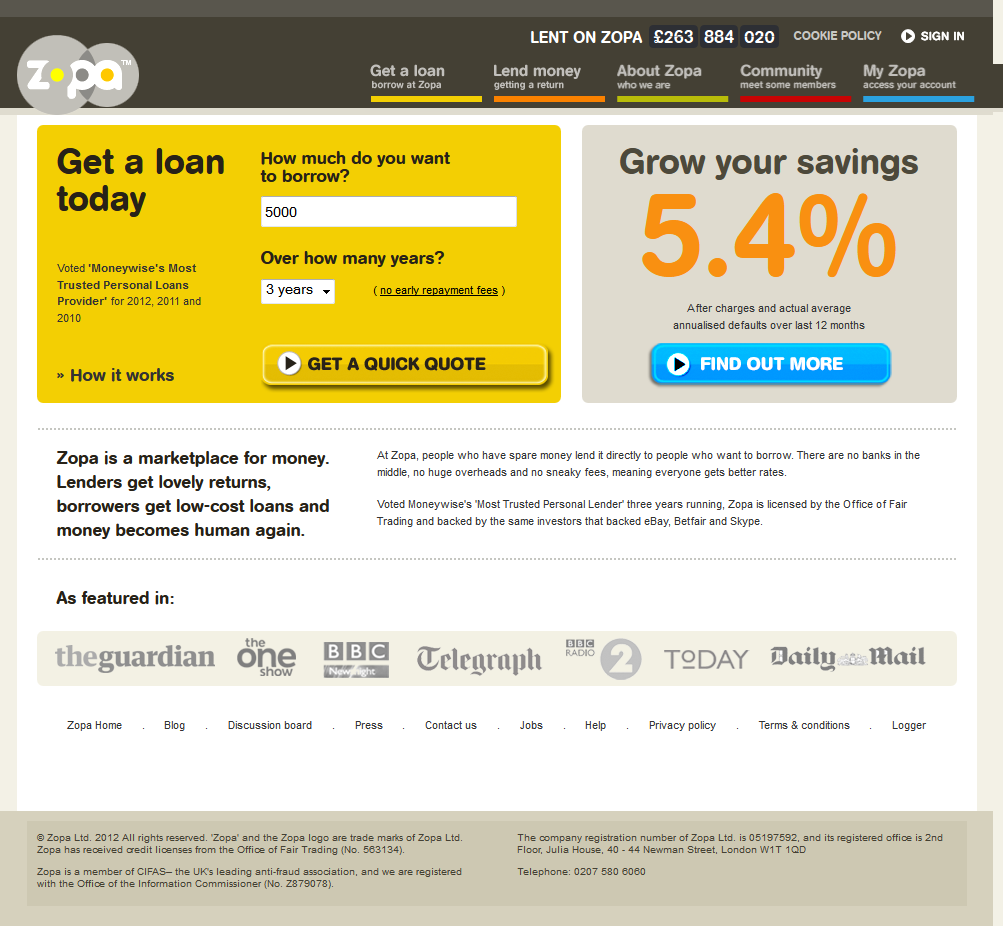
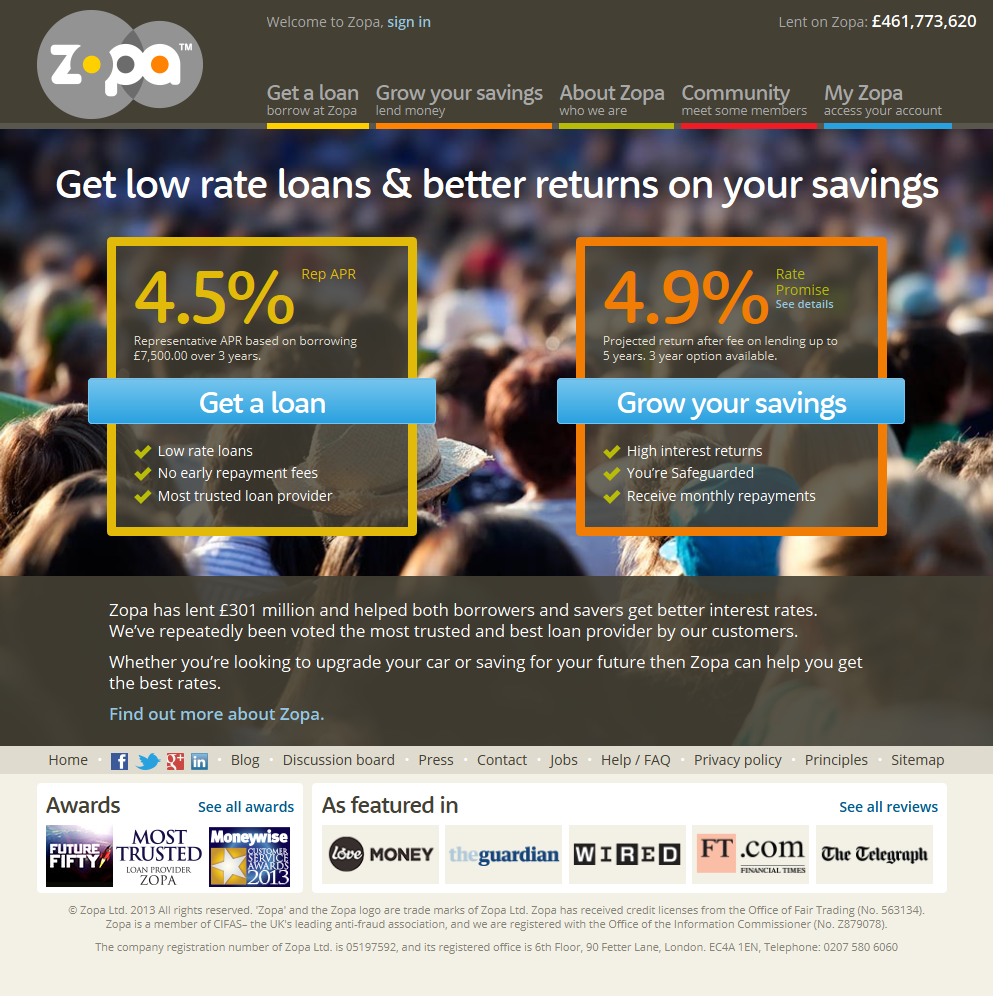
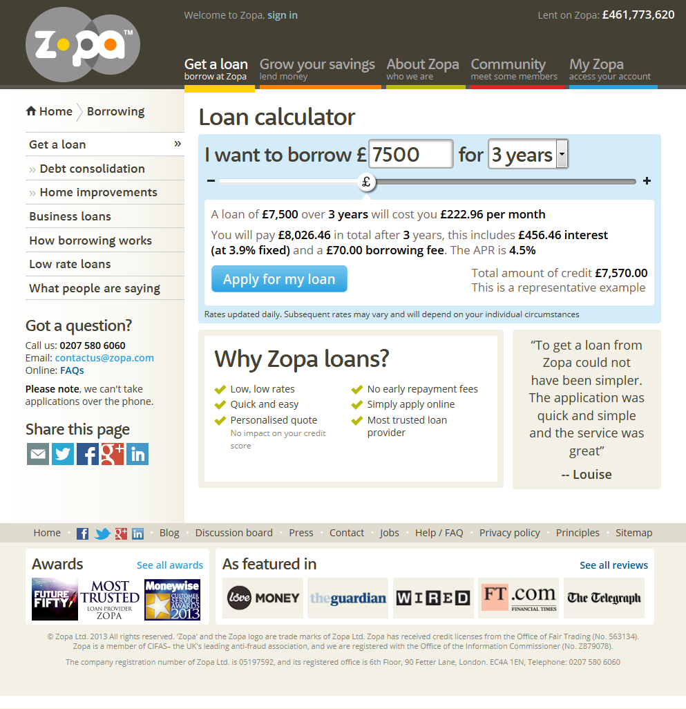
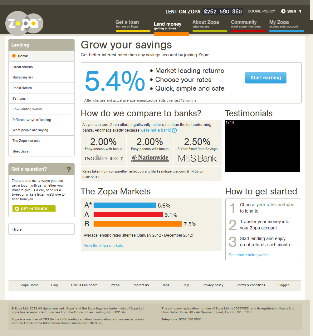
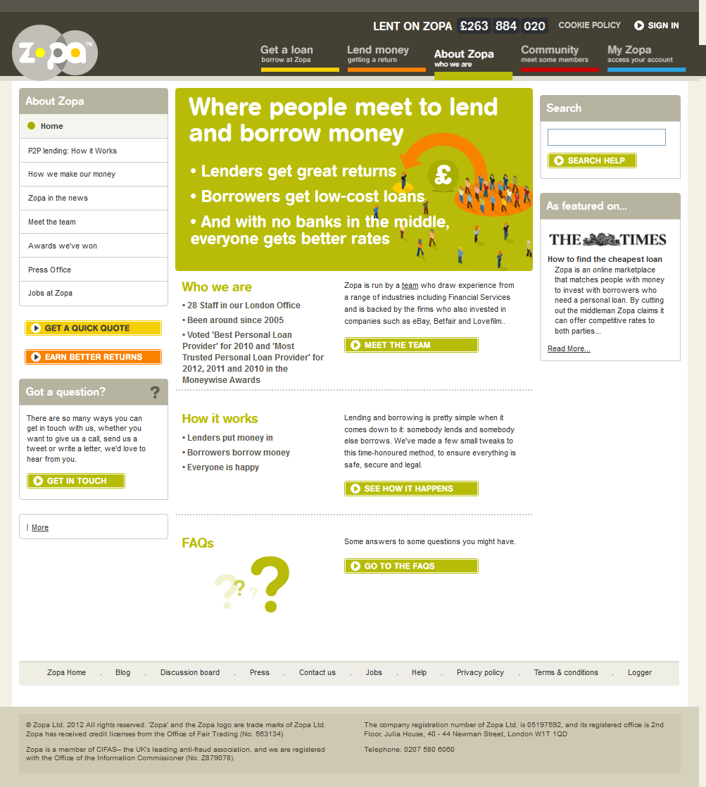
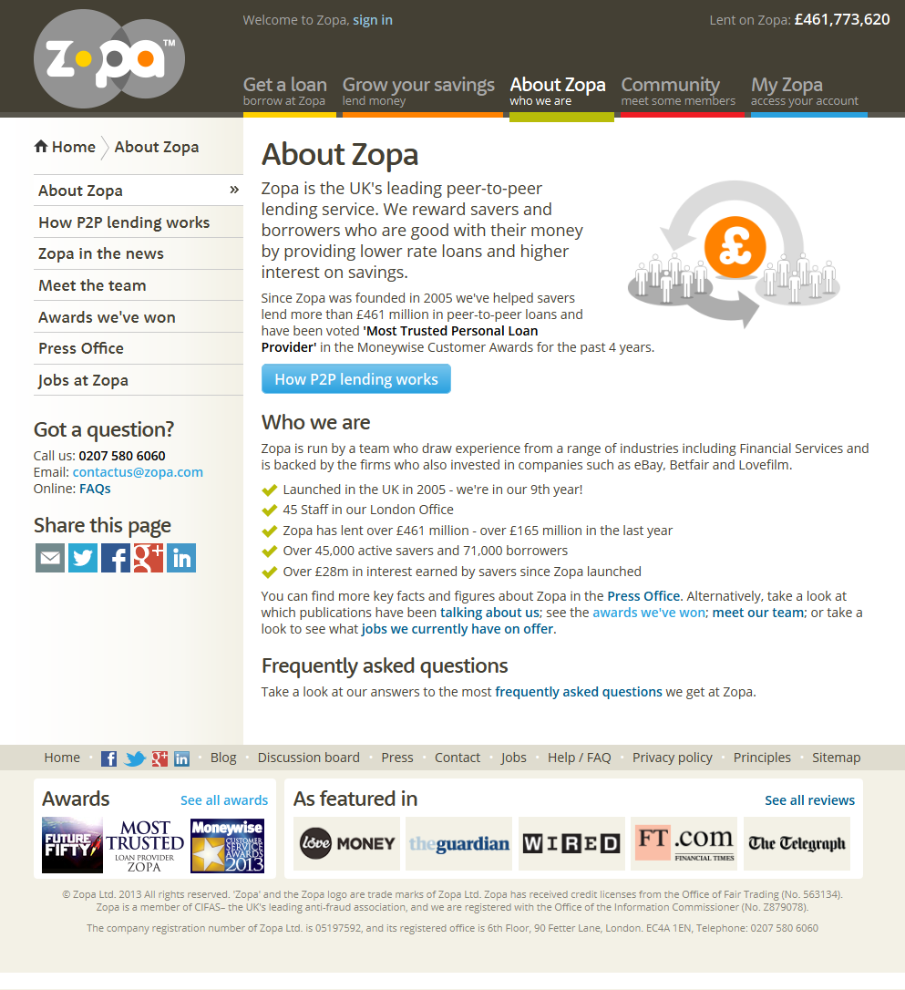
And finally here are some screenshots taken in January 2013 (just after I started working at Zopa, i.e. before I made any of the changes described above) and February 2014 (when 99% of the website had been rewritten). Due to the redesign in June/July 2014 I have also added a third screenshot per page to show how the website looks right now.


[…] I was rewriting and redesigning most of Zopa’s website iteratively in 2013, I used a specific method to refactor the CSS. When trying to explain how I did […]